Starkflow - Recruitment Platform
In January 2020, Starkflow offered me the incredible opportunity to work as a UI/UX Designer. Starkflow is a remote hiring global platform which has carved out a niche for itself among companies and candidates because to its straightforward yet original method of combining remote hiring, payroll, and compliance management. And it was my responsibility to entirely redesign the platform so as to improve user experience. Because it was before the pandemic and firms all over the world had not yet fully embraced remote hiring, this was an interesting project to work on. Knowing the benefits of WFH, I was drawn to the concept right away. Our main goal, which we accomplished in close collaboration with the product managers, was to align the platform with more contemporary and streamlined UX standards. I was the sole designer in charge of deriving the initial audits, flows, and wireframes and later translating those insights into the final designs throughout the entire redesign.

Overview
In January 2020, Starkflow offered me the incredible opportunity to work as a UI/UX Designer. Starkflow is a remote hiring global platform which has carved out a niche for itself among companies and candidates because to its straightforward yet original method of combining remote hiring, payroll, and compliance management. And it was my responsibility to entirely redesign the platform so as to improve user experience.
Because it was before the pandemic and firms all over the world had not yet fully embraced remote hiring, this was an interesting project to work on. Knowing the benefits of WFH, I was drawn to the concept right away. Our main goal, which we accomplished in close collaboration with the product managers, was to align the platform with more contemporary and streamlined UX standards.
I was the sole designer in charge of deriving the initial audits, flows, and wireframes and later translating those insights into the final designs throughout the entire redesign.
My Responsibilities
For both candidates and clients, I was in charge of auditing, developing flows and wireframes, and designing the final dashboard, jobs page, teams page, messaging page, and profile page.
After my initial team onboarding meeting, I took some time to go through the heuristic notes I had acquired. This led me to do a UX audit of the platform in its present condition in order to find problems, prioritize them in terms of importance, and conceptualise solutions. The process of creating wireframes and prototypes was iterative and changed with each meeting as we had to take into account the limitations of the development environment that could affect the designs when moving from web to mobile platforms.
My Role
As the only designer on the small team, I was in charge of creating a visual language, setting up a responsive design system, piloting the UX design process through UX interviews, and visualising the changes as a result of various discussions and iterations. I also worked closely with their product team throughout the entire stint.
- UX consultation during meetings
- User Research
- UX Auditing
- Wireframing, prototyping & Redesigning
Empathise
The Users (Primary Research)
This UX redesign project aimed to help clients looking to employ people from all over the world as well as applicants looking to work for businesses that perfectly fit their requirements.
- User Objective:
🎯 Due to the ambiguity of the employer's needs, we were able to obtain more precise answers to the requirements during our early discussions, from which we were able to determine the following:
🎯 Because of the challenges in employing people from other countries, paperwork and payroll would require extra resources from the employer. Consequently, the attention was shifted away from business and toward what mattered the least.
🎯 Employers had to review each profile on a number of hiring portals in order to discover the -ideal fit. It was preferred that only those applicants who were most qualified for the position might submit applications.It was noted that salary negotiations can be seemingly endless. In order to eliminate negotiations and other formalities, a fixed fee structure and transparent pricing were developed.
- The following criteria were noted when we spoke with several candidates who were looking for work on various platforms:
🎯 Companies were encouraged to disclose the precise wage they are prepared to provide since otherwise a candidate would spend a lot of time interviewing only to decline the offer because the pay wasn't what they had anticipated.
🎯 Companies occasionally include ambiguous or confusing job descriptions in their postings, which ends up wasting both candidates' and employers' time. It was necessary to employ a common design system to accommodate both users at once.
🎯 A brief chat feature after applying for the job helped the candidate stand out from the competition and let the employers know how well-suited they are for the position.
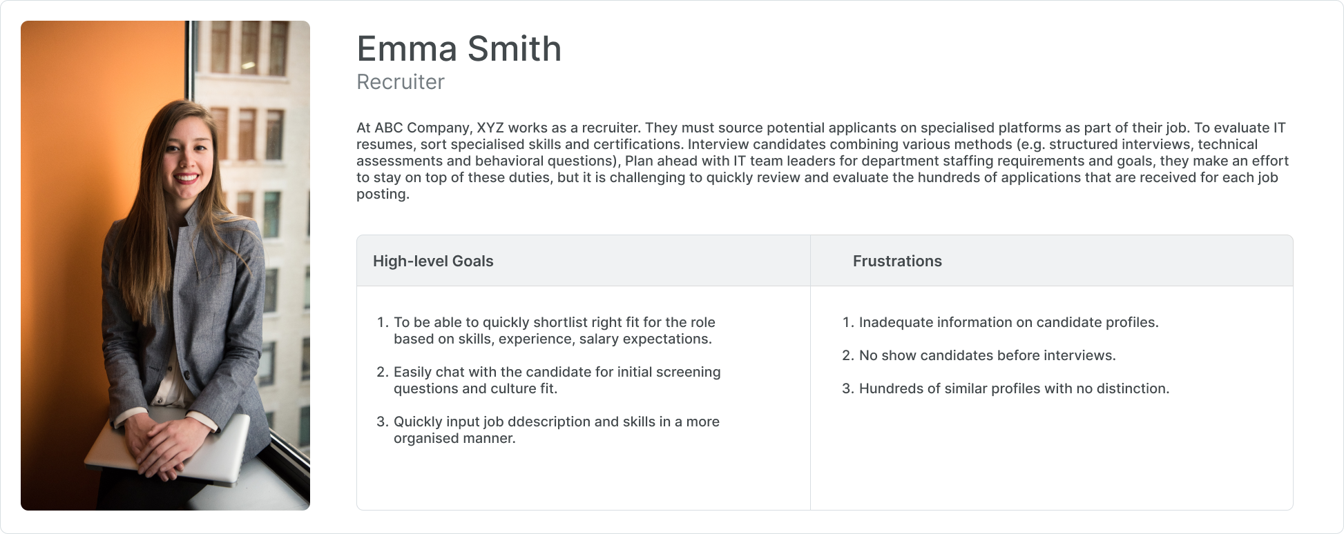
User Persona
After going over our key findings on employee behaviours during our team meetings, I fabricated a user persona for both employers and candidates each.
A recruiter, who would be using the platform may be able to manage and grow their team, employ the best talent, and use a hassle-free payroll system.
Competitor Analysis (Secondary Research)

Define
How Might We
In order to pinpoint important areas for concentration and viable remedies for developing a successful and efficient remote recruitment process, we engaged in a "how may we" exercise. This activity enabled us to:
Conducting a heuristic platform audit was actually advantageous as I was active on platforms such as LinkedIn, Indeed, AngelList, etc.
- Recognize the particular difficulties and problems that remote hiring presents for both job seekers and companies.
- Determine the essential characteristics and capabilities that a remote hiring platform would require to succeed.
- Make a list of concepts and solutions that might be used to solve the problems and pain points that have been identified.
- Set priorities for development and concentrate on the areas that will have the biggest impact.
- Encourage the development of innovative solutions through teamwork and creative problem-solving.

Ideate
Information Architecture

Existing Platform Usability Audit
Conducting a heuristic platform audit was actually advantageous as I was active on platforms such as LinkedIn, Indeed, AngelList, etc.
- Usability Audit: I started examining particular pages and interface elements that I thought would be possible pain points after becoming more accustomed to the platform and gaining a better understanding of the information architecture. I then categorised my observations according to how seriously they hindered usability.


Pain Points


Paper Wireframe

Prototype
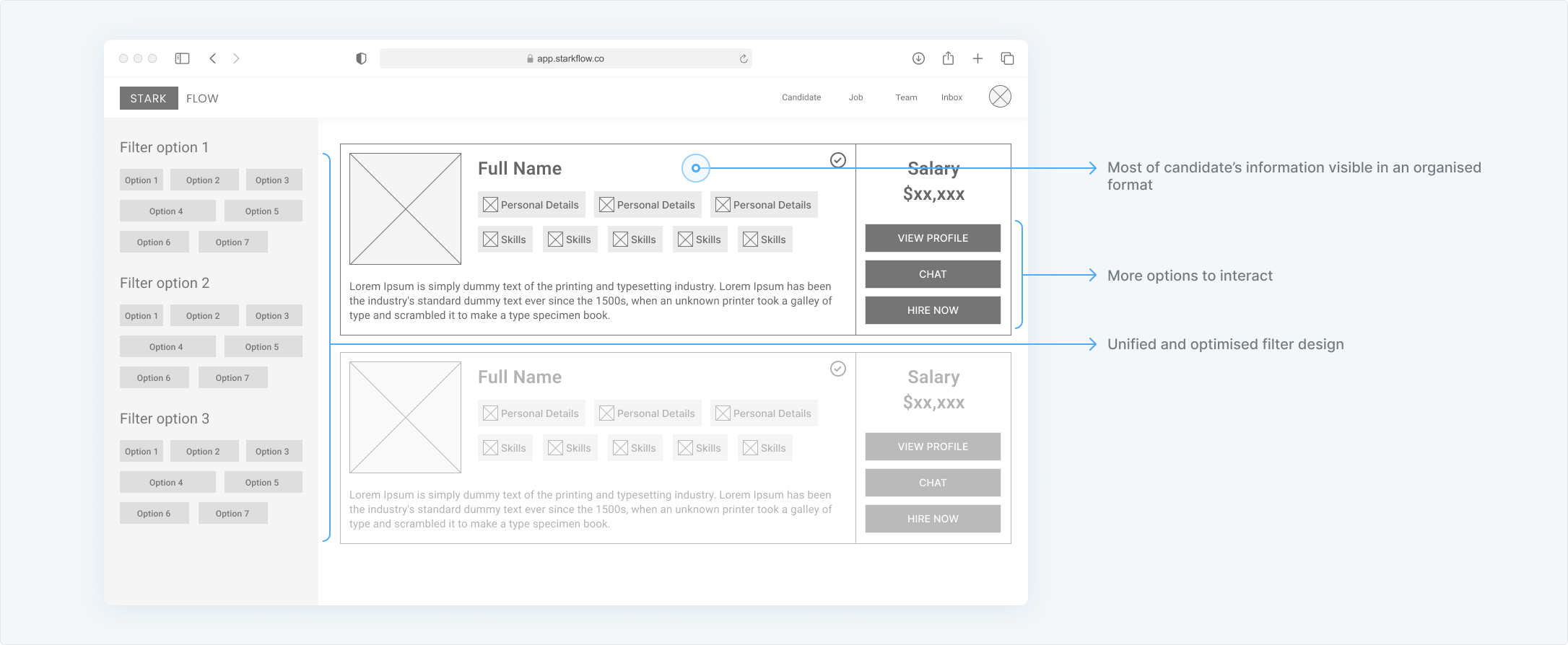
Low-Fidelity Wireframes
I started developing some ideas with a primary focus on streamlining the navigational structure and enhancing the wizard experience because I now know where fundamental problems still exist.The wizard required modificaitons. This required creating form elements that were readable and consistent. In terms of usability, this meant making it easier for users to post jobs because I used mostly attempted to keep with single-click selection types.


Second Iteration Wireframes
The former design's inconsistency likely stemmed from a lack of attention to detail and organization in the layout. By giving proper grid structure for the sections a higher priority in the second version, I was able to create a more structured and cohesive design. This new structure likely made it easier for me to understand how different features and sections fit together and how to use space effectively to display information. Additionally, this approach can make it easier for users to navigate and understand the information presented on the page, as a well-organized layout can help guide their attention and make the information more easily digestible.


Design System
Regarding visual design upgrades, our main goal was to give the platform a significant makeover while maintaining a substantial degree of continuity with the company's design system.
A user interface's consistency in design refers to the uniformity of its components. In order to provide the best possible user experience, I always prioritise responsive web design, which makes the Starkflow website and hiring platform responsive and entirely platform agnostic. I created a fully responsive design framework and over 200 screens while making use of the design system throughout this project.

High-Fidelity Design
Information architecture is the foundation of designing wireframes. A little more thought given to the layout and component helped in the mid fidelity wireframe. While, seeking for suggestions and imploring for ideas from literally every person in the team; a good high fidelity mockup is evident.


Takeaways & Findings
Overall, working on this project with new coworkers was a fantastic experience. It was really interesting to analyse the enormous variety of variables and design considerations that must be made for everything from straightforward user experiences like filling out a form to trickier issues like selecting candidates with the right abilities for the open position.
I had the chance to work on this project with an outstanding group of people that shared similar interests. It was initially a little intimidating to collaborate remotely and schedule check-in calls (as well as interviews) across several time zones. In the end, though, it encouraged me to use the time we had together more effectively and communicate more.
Noteworthy Highlights:

Learnings:

What I could've done better:
